Cover: Add Padding Styles #21492
Cover: Add Padding Styles #21492
Conversation
 ItsJonQ
added
[Block] Cover
ItsJonQ
requested review from
ajitbohra,
chrisvanpatten,
ellatrix,
jorgefilipecosta,
Soean,
talldan and
youknowriad
as code owners
ItsJonQ
added
[Block] Cover
ItsJonQ
requested review from
ajitbohra,
chrisvanpatten,
ellatrix,
jorgefilipecosta,
Soean,
talldan and
youknowriad
as code owners
|
Size Change: +4.32 kB (0%) Total Size: 1.12 MB
ℹ️ View Unchanged
|
| loop | ||
| src={ url } | ||
| /> | ||
| <BoxControlVisualizer values={ padding }> |
There was a problem hiding this comment.
Only difference is that the content is contained within <BoxControlVisualizer />
packages/components/package.json
Outdated
| @@ -53,6 +53,7 @@ | |||
| "re-resizable": "^6.0.0", | |||
| "react-dates": "^17.1.1", | |||
| "react-spring": "^8.0.20", | |||
| "react-use-gesture": "^7.0.9", | |||
There was a problem hiding this comment.
Leveraged for improved gesture handling. Created by the folks behind react-spring ❤️- an animation library that we currently use within Gutenberg
packages/components/src/flex/flex.js
Outdated
| */ | ||
| import { Flex as BaseFlex } from './styles/flex-styles'; | ||
|
|
||
| function Flex( |
There was a problem hiding this comment.
A layout primitive! Very handy for many common UI cases ✌️
It was used within BoxControl
There was a problem hiding this comment.
Do you think we need a README for this?
There was a problem hiding this comment.
It's a bit unclear what this gives me over CSS flexbox? Why would I use this instead?
ItsJonQ
force-pushed
the
try/cover-padding-control
branch
from
69bcd37
to
806a615
Compare
|
@youknowriad / @nosolosw Haii 👋 I'm trying to use the new style hooks with these padding controls. It was working a couple of days ago. I just checked and it looked like the inline style CSS variables aren't rendering anymore 🤔 . I would love some insight/thoughts! No rush at all! Thank you! <3 Very excited to be tapping into this style system layer. |
|
How does the "Adds dimension controls to Group Block" PR: #16730 padding/margin controls I am thinking there should be one margin/padding component/method to be used for all blocks. |
|
Hi! I'm thinking about the conjunction of this PR with #21091. In particular: why present all four padding controls instead of just two contextual ones? Let me explain: what if there were two controls that represent "distance to horizontal edge" and "distance to vertical edge"? Then, if the user selects grid position [0, 0], these settings correspond to When grid position [1, 1] (i.e., centre-middle) is selected, then the user might either see no controls at all, or all four padding controls if they really want that option. |
|
@ItsJonQ The issue is probably because we moved from CSS variables into inline styles. You should add your inline style mapping here https://github.com/WordPress/gutenberg/blob/master/packages/block-editor/src/hooks/style.js#L45-L49 |
 ZebulanStanphill
added
the
Needs Accessibility Feedback
ZebulanStanphill
added
the
Needs Accessibility Feedback
|
I think it's also worth noting, for accessibility reasons, the controls ought to be presented in a DOM/tab order that matches their visual order and makes sense. Going by that, the "All" input should come before or after the individual side inputs, rather than in the middle of them. Personally, I think we should try to promote presets over one-off values, so setting the padding should be similar to setting a font size, where presets are provided alongside a "custom" option. I think instead of 4 individual side controls + an all sides control, there should be 4 individual side controls + a toggle to lock horizontal values together + a toggle to lock vertical values together. I also don't think it is necessary to present the options in a fancy cross layout. I think labels like "left" or "horizontal" can convey that just fine, and simplifying the presentation of the controls gives room for a UI more like the font size control to be implemented. |
ItsJonQ
force-pushed
the
try/cover-padding-control
branch
from
806a615
to
74883be
Compare
@youknowriad Ah, thank you so much! I was able to get the inline styles to connect with the controls. However, I noticed an issue... Since the
The The only solution that I can think of would involve rendering the values as CSS variables rather than direct style properties. This will enable me to "subscribe" and render those values within the inner Cover. This will work for both Edit and Save. That being said, I'm open to any suggestions! <3 |

@ZebulanStanphill Thanks for the suggestion! I just made that push. Originally, I wanted to optimize the tab order to fit the mental model of how directional styles are rendered on the web (top, right, bottom, left). However, I recognize that it's a model that only people who have experience with it would have. The tab order being tied to visual representation has a much stronger connection 👍 |
|
@ItsJonQ Actually, the best solution here is to refactor the Cover block to use the new |
| @@ -40,6 +40,9 @@ | |||
| }, | |||
| "customGradient": { | |||
| "type": "string" | |||
| }, | |||
| "padding": { | |||
There was a problem hiding this comment.
Perhaps we could follow suit on what was done for colors & font-size, so we wouldn't need to declare this attribute per block and declaring support for __experimentalPadding would suffice.
@youknowriad Sounds good! For the time being, should we go with the CSS variable approach in this PR? Or should we pause on this one to wait for the refactor? Thanks! |
|
@ItsJonQ I'd rather try the lighterBlockWrapper first on a separate PR, maybe it's not that hard :) |
|
@nosolosw Thanks for the feedback!! I'll take a looksy 👀 |
@nosolosw I guess this is a design decision! Should "Reset" act like a "Clear"? (Where the values reset back to I'm okay with either! At the moment, like you pointed out, it's set to reset based on initial session value. Thanks! <3 |
|
I think Reset should work to unset any user changes made. Mostly because if that's not the behavior, is there a way for a user to do that? |
@jasmussen Gotcha! Thanks for the confirmation :). I'll work on making that happen 💪
At the moment, no. Which I suppose is why we need it to completely reset (or clear) changes :) |
|
Good catch, Andres, and thanks for keeping on this Q, it's such a pleasure to watch you work. |
|
@ItsJonQ another thing I've just noticed is that the padding attribute is stored directly as a key under
If we're preparing the reset change for tomorrow's release, I guess it'd be good to consolidate the padding under the |
|
@nosolosw Thank you for the suggestion! I think the |
|
Feedback: Another example. |
|
Showing the light blue padding overlay when focused/hovering on the associated input sounds like a neat idea. 👍 |
|
@nosolosw I have updates! I'm able to adjust the logic to handle reset ( Thanks for the suggestions @ZebulanStanphill + @paaljoachim ! |
|
Oh boy oh boy! 🎉 |
|
PR here :) |
|
I'm using a lot of gutenberg controls on non gutenberg admin pages... This one, I'd like to use in a few places... what about allowing custom icons so we can do something a little like:
Interested if this is something I should pursue in adding to this, or just copy out the component and customise just for my project. |
|
@rmorse Ooo. That's an interesting idea! 😄 |
|
I think we'd want to create some specific versions for some of these properties instead. For example, we have border radius in Button, but it looks nothing like this and we should be consistent internally and in the public component API |
|
@mtias if you're referring to my mockups - this was just an idea, for my own personal use case - developing admin pages outside of the Gutenberg editor, using Gutenberg components (I guess this is the future workflow for WP admin in general - where theme / plugin authors will be reusing gutenberg components to build their own admin interfaces). So what I want to be able to do is allow each dimension to be controlled individually, ( ie, the border radius properties ), rather than be "stuck" with Gutenberg best practise as in your example the radius control, because my use case is different - and this is a great component I could be repurposing. I of course agree that it's necessary to keep consistency / good practice patterns within the Gutenberg editing experience, however I would love to keep the kind of flexibility that choosing custom icons would provide for this component, and as a general pattern / approach it would be great to bear in mind flexibiliy with components for developers as a whole, who will be building custom UIs now, and even more so further down the line using Gutenberg components -I'm not sure you are actually suggesting to limit this flexibility... but wanted to share my perspective anyway :) I'm nearly finished working on a plugin with a custom admin UI, and overall its been a fantastic experience dropping in Gutenberg components all over the place, saving me countless hours and making it 100x more accessible. |
Hi all 👋,
Hope you're doing well! I've been working on an exciting update for the Cover block.
This PR adds the ability to add
paddingstyles to the coreCoverblock. This feature compliments adding internal alignment via Design Tools to improve customization within Gutenberg.Demo
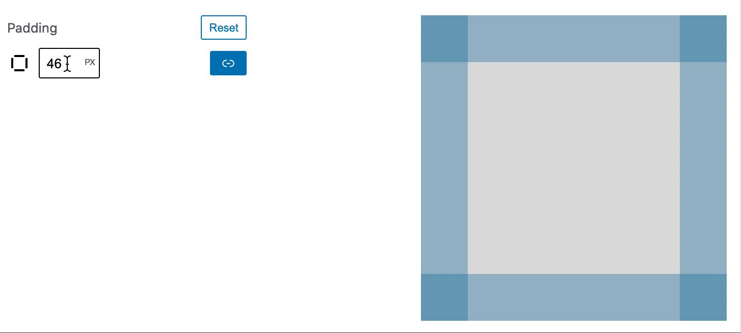
The GIF above demos interacting with the various sides of the new Padding controls. Any changes to Top, Right, Bottom, Left, or All, instantly updates the Cover padding within the Editor's canvas.
New Components
Designing the new controls for padding was an challenging and exciting journey. The goals were:
To accomplish these goals, I've put a lot of focus on UI components, specifically on the
inputelements themselves. Taking in consideration how they behave with the Cover as well as with each other.Note: The updated/new input/control components supports RTL 🤘
InputControl
The newest, and tiniest, component I've added is a low level
InputControl. It's an enhanced version of a bare bones HTML<input>. It's styled out of the box in the spirit of "G2" ([the next advancement of Gutenberg]). More importantly, it has built-in support for "floating labels".The "floating label" feature allows us to have (important) labels for the various directions (e.g. "Top") within the condensed space of the sidebar.
NumberControl
InputControlnow powersNumberControl!NumberControlwas enhanced to enable drag to increase/decrease values! 😍This allows for a more organic experience. In the context of
Cover, it allows the user to make fluid adjustments without having to use a keyboard.Speaking of keyboard... holding
shiftwhile dragging increases the step by10!Just like if you were to press
shift+UPorDOWNarrow.UnitControl
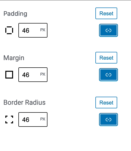
NumberControlpowersUnitControl!BoxControl
Finally!
BoxControl.BoxControlis a generic controller for Top, Right, Bottom, Left values. In this case, we used it forpadding. But it could easily be used formarginvalues as well (if we desire).Under the hood,
BoxControlusesUnitControlfor all of the sides.P.S.
BoxControldoes support custom units. However, I'm unsure how to fit that experience within the UI right now. Ideas welcome!!Visualizer
BoxControlhas an accompanying component calledBoxControl.Visualizer. It's designed to flash the side that was most recently changed.For example, updating the top padding will result in the top flashing ✨
Rendering (CSS)
The
Coverhas been outfitted with support hooks to render the CSS in the Editor and on the site's front-end. These support hooks are part of the work on global styles.Testing
This update can be tested in a local Gutenberg development environment.
Be sure to
npm installfirst!(Potentially
lerna bootstrapas well)Note: At the moment, the
paddingstyle values aren't being applied to the Cover block. It was working, but I believe the implementation is not compatible with some recent style hooks changes .Opt-in
This feature is opt-in via
add_theme_support. In order to show the padding controls, the following needs to be added to a theme'sfunction.phpThank you so much 🙏
Checklist:
Related:
#16730