Add some unified micro-interactions #8029
Comments
|
Some explorations from the old days:
|
|
Some more noodles from days gone by:
--
Mobile ideas. --
Moving blocks. |


|
Here's another exploration around the inline inserter:
I really dig the glowing placeholder while you pick a block. |

|
Noting we should include: #7272 in this. |
|
Moving this to phase 2 for the future. It would be great to see this as a focus in that. |
|
Agreed. A consistent set of good microinteractions is the kind of refinement I would love to see going forward. |
This PR aims to start work on #8029, by creating an animation for use with popovers, and by starting documentation for hwo to best use animation.

It:

- Adds a "scale and appear" animation to the block toolbar, the more menu, and the block library
- It adds a very very early draft of an animation document, which includes an early inventory of current animations in use.
|
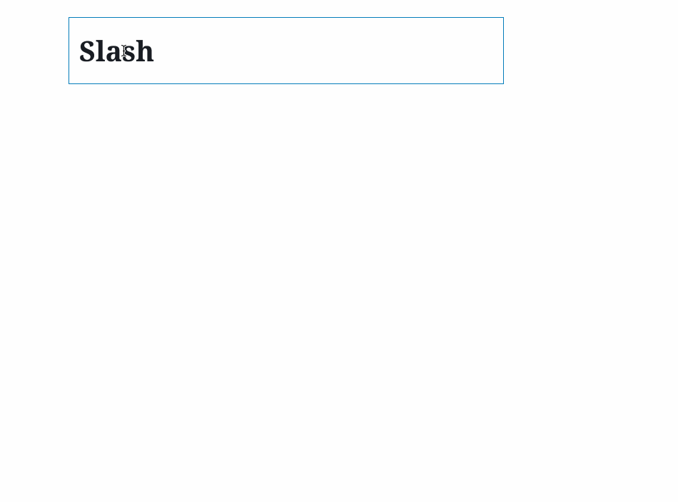
Not sure if it counts as a "microinteraction", but menu items will soon have a hover color: #13732 Also, the menu animation is really nice to see in the slash command:
The sidebar might also receive animation soon: #13635 Not sure if this is in the category of microinteractions, but it definitely improves the interaction around notices that they push down content: #13614 I was thinking about what it would constitute to "wrap" this ticket. Not necessarily suggesting we're quite there yet, but with the addition of documentation for animation, and a new animate component, it feels like we have the structure for adding microinteractions in a consistent way in place. Maybe that's a good start? |
Since those are in place, I think it might be helpful to come up with a shortlist of areas that might benefit from some animations? Then we can turn this into a checklist with a clear ending point. Otherwise, we can probably close for now. |
|
Discussed these in the accessibility team meeting today, and adding some microinteractions can definitely help with some usability concerns, but we do want to call out some accessibility issues to watch out for:
These issues can be quite severe, and having the option to disable all animations can be the only way to resolve significant cases.
This can create some really weird results as the AT tries to parse a region that's actively changing.
Referring back to item 1; there's nothing like an unexpected animation to trigger a vestibular response. |
|
Considering this proposal of mine from last week:
I spent a little time browsing through the interface and referring back to things that've been mentioned above. Here's a short list of animations to consider. These aren't necessarily areas that need microinteractions, but they're worth exploring based on our prior discussions and the work we've done so far. For clarity's sake, I've linked to a GIF of the current (animation-less) behavior where it made sense. Global Interface:
Blocks:
To #3 of @joedolson's a11y list above, Each is triggered by a distinct user action, except for the notices one in some cases. Do any of those seem problematic/not worth exploring? Is there anything missing? |
|
I love the work being done here! I'll have a look at your list @kjellr, thanks for that, but one thing I noticed in G 5.1.1 is that sometimes tooltips get in the way of the micro interactions. It seems to
|

|
For the a11y concerns with motion, we should try to respect the Right now this is only supported in Firefox and Safari, so we'll still want some way to disable animations in the editor for other browsers. |
|
I'm going to go ahead and close this for now — this is a category within the broader Tighten Up focus, so these sorts of interactions will be continually be addressed moving forward. We'll open up tickets as needed for individual enhancements as we work on them. Thanks! |
This is one thing that has been mentioned in a few issues and I thought it was worth creating one issue we can all think and get some actions from. Right now there are some interactions that have feedback, but it's a little sparse. Whilst we have to balance both accessibility, performance and usability, there is some room to add delight and interactions.
The types of interactions we should consider I think are:
It is important in suggesting to note that we want to focus on micro-interactions, here is a good guideline here:
They should enhance, not distract and not prevent usability. Any interaction like this should be consistent, this is why I've added the word 'unified' to this title. The idea is we think around and then come up with a united plan for this. Interactions like this add up to tell the story, they need to be planned and have a holistic approach in designing.
We should consider the personality of Gutenberg in this. My own personal feelings are that these are a few words we should focus on in whatever animation we go with:
What else would you add?
Where could we add this?
Some aspects of the interface I think could get micro-interactions/unified (some have but we can iterate):
A good article I'd like to link as a consideration and that has some great examples in: https://material.io/design/motion/understanding-motion.html
One issue I am closing to bring in is this for consideration:
#2939.
This is a lot but I am really interested in what people think on a few things:
Along with this if you want to dive in and do some designs please do.
The text was updated successfully, but these errors were encountered: