[WIP] Block Support: Custom secondary colors support #33157
Conversation
Adds a new component that handles progressive display of block support controls within an inspector controls panel. It also triggers resetting block support attributes when controls are toggled on/off.
In addition to using the new block support panel with progressive display of controls, the panel has been renamed Dimensions with the view that future block support for height and width will be added within this panel.
This is to prevent the block support feature appearing within the new block support panel's menu.
This will need updating with uploaded screenshots.
This does NOT change the shape of the block attributes style object. Spacing related block support styles such as margin and padding remain under `style.spacing.padding` etc.
Default controls now show as checked when panel initially displayed. These controls can also now be toggled off from display.
 aaronrobertshaw
added
[Status] In Progress
aaronrobertshaw
requested review from
ajitbohra,
ellatrix,
oandregal and
spacedmonkey
as code owners
aaronrobertshaw
added
[Status] In Progress
aaronrobertshaw
requested review from
ajitbohra,
ellatrix,
oandregal and
spacedmonkey
as code owners
|
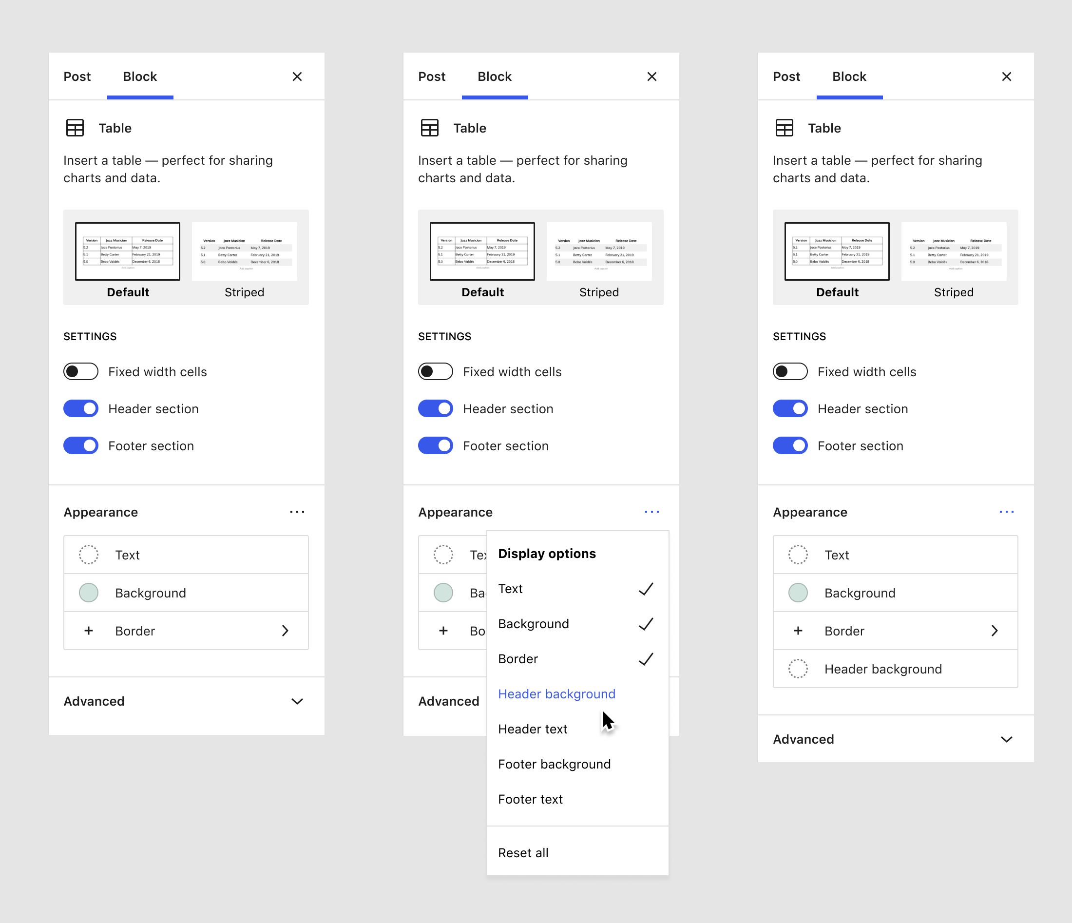
@jasmussen If you have a few spare moments it would be great to get your initial thoughts on how best to reduce the UI clutter when adding custom secondary colors to blocks. I know you've suggested an "appearance" panel previously however I don't believe we are at a point that can be achieved just yet. I'm hoping this might be an intermediate step along the way to that. Also, the collapsed color control will be used within this panel as soon as it's imported into Gutenberg but for now, as hard as it is, we'll need to look past those controls. In this experimental PR, I've based the work off the new progressive disclosure panel and adding header, footer and striped colors to the table block. It serves as a good example of the large number of controls possible, at least color and background for each set of colors. While the progressive disclosure panel helps, its menu would still have nearly a dozen items if added individually and link colors etc were also included. To try and reduce that, this PR looks at semantically grouping the colors within the panel's menu. This has some drawbacks though. If you toggle on the "Header colors" menu item, both the color and background controls for the header will be displayed. When toggled off the same menu item, both controls will be reset and no longer displayed. Nothing is set in stone around this, so any feedback would be greatly appreciated! 🙏
|

| @@ -127,7 +127,27 @@ | |||
| "align": true, | |||
| "color": { | |||
| "__experimentalSkipSerialization": true, | |||
| "gradients": true | |||
| "gradients": true, | |||
| "sets": [ | |||
There was a problem hiding this comment.
Hey, I appreciate the effort to prepare the proposal.
I think I've mentioned this in other places but can't find now the link. The most promising path to add more style options to a block is exploring the elements API. Right now, it works in theme.json and only with a limited set (link and headers). We could look into expanding this to more elements and port it to block supports. This idea is in line with design explorations for the global styles interface. I presume elements should also have an equivalent in the block styles interface.
We've explored in the past the idea of adding translations (e.g.: more metadata) to block supports but the overall thinking was that it should remain a lean API.
There was a problem hiding this comment.
Actually. It'd be good to have some confirmation about direction here, in case I've missed some context on this. cc @jasmussen @mtias how do you see us enabling more style choices for blocks? Are elements the way to go?
There was a problem hiding this comment.
Can you expand a bit what you mean by "more style choices"? Do you mean like how #31149 has both background color and overlay background color on the same block?
There was a problem hiding this comment.
Thanks for the direction @nosolosw 🙇
The most promising path to add more style options to a block is exploring the elements API. Right now, it works in theme.json and only with a limited set (link and headers).
I've misunderstood the intent of the elements API then.
Would you be happy for it to contain CSS selectors that are more complex than simple DOM elements such as h1, h2, h3 etc? The elements API might also need updating so CSS pseudo classes such as :hover could be used. That would allow a secondary set of colors to be applied to a button for example.
We've explored in the past the idea of adding translations (e.g.: more metadata) to block supports but the overall thinking was that it should remain a lean API.
Ok, I found #30293 which made it look like allowing the translation of the secondary color labels would just be a matter of adding an entry into packages/blocks/src/api/i18n-block.json to cover the label fields.
How would we allow blocks to define a label for a secondary set of colors, if using the elements API? For example, header, footer and striped colors for tables, active/hover colors for buttons etc.
There was a problem hiding this comment.
Can you expand a bit what you mean by "more style choices"?
Yeah, I may have been too concise. Let me expand how I think about the next steps.
A block can always add a custom panel to its block sidebar as in #31149 That's fine. We need to allow blocks to register custom panels in the global styles sidebar as well: this is a feature we don't have at the moment and that may need to wait a bit until the UI for global styles is more developed (some progress at #32923).
The alternative approach blocks have, and what I meant by "more style choices", is the block supports API. What are the next steps for it? This PR proposes to expand this API by adding the concept of "sets". My question is: shouldn't we develop the already existing concept of "elements" instead? As I see it, there're two things to do as a follow-up to #29891:
-
UI for elements: elements have a matching UI panel for them. It's already mocked up for the global styles sidebar but it's not for the block sidebar. Shouldn't the users be able to style elements a block supports via the block sidebar as well?
-
The HTML representation of elements: while elements have a default serialization to HTML (
linkis serialized as theaCSS selector), blocks should be able to hook into this to modify it.
By doing these two things, we enable users to interact with the global styles sidebar in a more semantic way: when users update the link element in the global styles sidebar they are not changing the a elements but they are styling links across the site - no matter how they are serialized to HTML. At the same time, users will also gain the ability to change elements that are part of complex blocks, such as table, search, navigation, etc.
As/If we walk down this path, we also need to look at what other elements are necessary: perhaps header and footer elements? Are there blocks that would benefit from these other than the table block? etc.
That's how I see things evolving. How do others feel about this?
There was a problem hiding this comment.
At a practical level, if we go the elements route, I presume it'd take some time to mature. In the meantime, I'd default to adding custom controls for blocks when the block supports API isn't enough. We can always refactor later to the new APIs we introduce.
There was a problem hiding this comment.
Thanks for expanding on this @nosolosw.
Shouldn’t the users be able to style elements a block supports via the block sidebar as well?
It makes sense that you should be able to via the block sidebar.
The HTML representation of elements: while elements have a default serialization to HTML (link is serialized as the a CSS selector), blocks should be able to hook into this to modify it.
This might handle mapping elements to appropriate CSS selectors. How do we get these translated when they relate to something a little more complicated such as a button’s hover state or the nth-child row of a table?
Another question is if elements are to be a closed set how do we scale this to allow different blocks to introduce their own requirements?
The table today might want header, footer and striped colors. Later, it might be desired to have a different set of colors for the row when it is hovered. Those then need different elements to perhaps ones that could be added for a nav block, maybe active/hover states, dropdown menu backgrounds etc.
I think there could be a third step required, allowing configuration and translation of labels for those element controls.
In the meantime, I’d default to adding custom controls for blocks when the block supports API isn’t enough.
It was taking such an approach that lead to this PR.
A simplistic PR adding ad hoc colors to the table ( issue ) was created to generate further discussion on how we could achieve secondary color configuration and application in a standard way. Not just for the table but any block.
The result of adding the desired controls to the table block in this case is a monster panel that doesn't have much chance of landing. It also then ends up with two panels dedicated to controlling color.
It would be good to find some middle ground where a temporary solution could be implemented before switching to the new APIs as suggested.
There was a problem hiding this comment.
This is an issue that affects more blocks, such as navigation. I shared with some folks (Riad, Matías) and they agree we should avoid extending our block supports or elements to add custom things at the moment. Instead, we should resort to custom controls if we need them to make progress.
I know that approach comes with the issue that these custom controls/styles can't be targeted via the global styles sidebar (users) and theme.json (theme authors). This is something we need to fix. As a starting point, I've gathered my thoughts at #33255 so we have a place to discuss it.
That's the overall stance for this. However, for this specific case, have you thought about converting the table to inner blocks? I know that approach can result in a suboptimal UX in some blocks that have many similar children, but I wonder how would it fare here.
There was a problem hiding this comment.
I wanted to note that I believe #32659 is a key ingredient in allowing global styles to style more properties. Right now one challenge is high specificity of default block styles, which is mitigated by that PR.
There was a problem hiding this comment.
Thanks for sharing, I'll read that one (no need to wait for me to merge, though, I see it's already approved).
I think it's a good question, and likely one where we need to take a few small steps forward and see how it feels. In that vein, it'd be ideal to build things simple first, and then tweak, so we carefully try to not paint ourselves into a corner. In this case, my instinct tells me you'd very rarely want to customize all those properties at once on a single table block. So further sub-grouping, even if semantic, doesn't seem hugely valuable, especially with the disclosure mechanism. Additionally, presumably text and background would be default for the entire table block, whereas header/footer sub-properties would be overrides? That seems to support just a long list. Speaking of "progressive disclosure" — I'd love to find a better name for it! Maybe "Appearance Panel"? Or just "Panel", with the other panel being called "Collapsible Panel"? The mechanism around adding or removing these controls is largely meant to be an invisible addition and not the defining characteristic. |
That makes sense to me. 👍 I'll revisit that aspect of the UI while also looking further into how I can achieve the same features leveraging the elements API.
The use of the "progressive disclosure panel" term has been my attempt to keep the delineation clear between it and the current panel, as that is its name in code, My only temporary concern with "Appearance Panel" is that until multiple block supports all inject their controls into one panel, we really have multiple panels ( and panel types ) that relate to appearance.
Do you think it is worth exploring the "slide-right" reveal as part of this PR/experiment? It could also pay dividends to start with a clean slate, working directly towards the appearance panel in the mockup shared in the earlier comment. That's something I can work towards if it doesn't interfere with other people's efforts. It could be a larger PR though after including things like borders in addition to colors. |
Yep, good point. And to be clear, I'm only seeking a better label for describing the particular UI in conversations like these, not as anything user surfaced. "Panel with a tools menu" is another way to describe it. Progressive disclosure is just a little bit technical, that's all.
Good question; on the one hand we have some confidence that we need the feature for various aspects of Global Styles (see color use case here), on the other hand I'm not sure we will want to use it that often for block editor inspector panels. That also touches on your next question:
As far as colors in that mockup go, I think they line up enough with the global styles mockup linked above that we can have pretty good confidence in that direction. But the border part specifically needs more time in the oven. While it might feel like part of "appearance", I think we need to look a bit to how borders might work in the future before we add it in the same category; we might look at borders as "strokes" instead, allowing you to layer multiple on top of each other, and use multiple properties including things like So as far as the border goes, we should probably keep that where it is for now, and work with the improvements that Jay has sketched out. Whether we move full on with regards to the global-styles-like compact color swatch group, I will leave up to you! |
|
Speaking of borders, do you know if we are ready to customize the border-left of quotes using theme.json with the latest border tools? |
You can currently set the border color via theme.json. All that is needed is to set the
We could easily expose the border block support's color control for the quote block as well. It would need an entry in the theme.json's blocks config to enable The catch with enabling the block support control is that the "Large" block style doesn't include a border, so conditionally hiding the block support control would be a bit of a hack at present, or subpar UX. The border block support UI refinements are just waiting on a final approval before merging. I can create a quick PR to enable border color controls for the quote block if you'd like. |

|
Thanks for that explanation, much appreciated. I think we'll definitely want to absorb the quote border when the tools are ready for it.
Good catch. If we were to absorb the default quote style into theme.json, it would only have a left border if the theme.json defined it so, right? In that case I'd think it okay for the Large style to then also have a border given there's a tool to unset it right below if need be. I think we could get the default CSS styles to have the right (low) specificity that they would be overridden by global styles if theme.json was present. |
Unfortunately, the border support doesn't currently allow for defining borders for individual sides e.g. left or right. The border width support could be used to turn the border on/off. If we allow control over border style as well we start to get into trouble. That would be applied via the
Without allowing for border style control, the theme can add the On a second look, it appears it was the TwentyTwentyOne Blocks theme that was disabling the border for me, not the "Large" block style itself.
The border color CSS rule generated by the theme.json will only have the block's selector That shouldn't be too hard to overcome. The theme.json resolver will handle merging the theme and user (global styles) supplied values. |

|
Gotcha, this was mostly a curiosity and separate thought, and thanks for the elaboration. At some point we'll probably want to tackle both the individual border problem, and the quote border properties. There's even a further consideration with RTL themes that might want the border on the right. Lots to think about, thanks again for the response! |
|
Being able to express the default design of Quote through theme.json value would be a good target to have to ensure we are building design tools that accommodate those needs. (It's much more useful to have individual border control than border style, for example.)
This is where we need to be able to express block style variations as specific values of style attributes and not blackbox class names. In the case of "Large" it might be just defining a style set where |
 aaronrobertshaw
force-pushed
the
try/block-supports-dimensions-panel
branch
from
aaronrobertshaw
force-pushed
the
try/block-supports-dimensions-panel
branch
from
4726898
to
2cf8fc6
Compare
aaronrobertshaw
requested review from
chrisvanpatten and
TimothyBJacobs
as code owners
aaronrobertshaw
force-pushed
the
try/block-supports-dimensions-panel
branch
from
b63b4e6
to
7c988d6
Compare
aaronrobertshaw
force-pushed
the
try/block-supports-dimensions-panel
branch
from
ea98a10
to
dbaa31c
Compare
|
Hey @aaronrobertshaw and everyone else. Could we get a status update on this PR? Thanks! |
|
Thanks for checking in on this one @paaljoachim 👍 At this stage, the approach taken in this PR is unlikely to be adopted in its current form. Further thought and discussion are required given this issue and any solution has a pretty wide impact. An issue has already been created to track this discussion however I haven't had the bandwidth recently to continue on this work. I'm hoping to revisit it in the weeks ahead. One likely course of exploration will be to extend the Elements API. Work specifically around colors will also likely wait until the new color picker components are finalized. Once it's clear whether this PR can be adapted or needs to be started over, I'll close or update it accordingly. |
|
Thank you! @aaronrobertshaw |
|
Related: #34741 |
|
I'm closing this PR as its approach will not be adopted. The issue tracking the problem this PR in part addresses is still open and the new styles engine will likely offer in the future the ability to target specific selectors etc e.g. hover states. |
Description
This is a proof of concept exploring the possibility of adding control over secondary colors for blocks.
Example use cases
Possible outcomes achieved with secondary colors support
Screenshots
Solution trialled in this PR
Block Support
Dimensions Panel: Add new ToolsPanel component and update spacing supports #32392
<style>tag or styled component to apply them in a standard manner while still honouring skipping serialization.Example block.json config for Table block
Each color set can specify:
{
    ...
    "supports": {
        "color": {
            "__experimentalSkipSerialization": true,
            "gradients": true,
            "sets": [
                {
                    "slug": "header",
                    "menuLabel": "Header colors",
                    "colorLabel": "Header color",
                    "backgroundLabel": "Header background color",
                },
                {
                    "slug": "secondary",
                    "menuLabel": "Striped colors",
                    "colorLabel": "Striped color",
                    "backgroundLabel": "Striped background color"
                },
                {
                    "slug": "footer",
                    "menuLabel": "Footer colors",
                    "colorLabel": "Footer color",
                    "backgroundLabel": "Footer background color"
                }
            ]
        },
    },
}
Table block
The table block has been used to test drive the custom color set support changes. The changes required to it are fairly straightforward. Both the edit component and the save, while rendering each table row check which custom color set might apply (header, striped, footer etc) and then apply inline styles for that color set accordingly.
The updates to the table block have been included into this PR for ease of testing however can be easily separated into a different PR should this progress at all.
Theme.json
The proposed secondary color sets can't be simply mapped to a block's selector as they'd likely conflict with the default color block support colors. These secondary color sets will only be needed for a subset of cases, likely targeting inner elements or state such as active, focused etc.
To allow for styles to be generated, the theme.json styles config for custom color sets requires a CSS selector to be specified. From there
class-wp-theme-json-gutenberg.phpwas updated to generate desired styles. The approach take here could definitely use some extra scrutiny and fresh ideas.Essentially, when processing a theme.json file, new style nodes are now created if a block's style config has a
setsproperty within itscolorconfig. When one of these new style nodes are processed withincompute_style_propertiesa new metadata schema is applied to setup correct style declarations within the scope of this new color set's selector.Example theme.json styling color sets for the table block
{
    "version": 1,
    "settings": { ... },
    "styles": {
        "blocks": {
            "core/table": {
                "color": {
                    "text": "#5d6d79",
                    "background": "#fcf2ee",
                    "sets": {
                        "header": {
                            "selector": ".wp-block-table thead tr",
                            "text": "#ffffff",
                            "background": "#2a2d42"
                        },
                        "secondary": {
                            "selector": ".wp-block-table tbody tr:nth-child(odd)",
                            "background": "#ffffff"
                        },
                        "footer": {
                            "selector": ".wp-block-table tfoot tr",
                            "text": "#ffffff",
                            "background": "#e48b9f"
                        }
                    }
                }
            }
        }
    }
}
Global styles
The UI for the Global Styles color panel has not yet been updated to support custom color sets. The plan is that it can be done once the overall approach is refined.
Alternate approaches
How has this been tested?
🚧 TBA...
Types of changes
New Feature.
Next steps
Checklist:
*.native.jsfiles for terms that need renaming or removal).