Add Axis titles by SwiftUI "overlay" as a workaround. #4405
Labels
Comments
This was referenced Jun 30, 2020
|
Thanks! Though maybe we prefer a pure CoreGraphics API, this is a good example for sure! I have pinned this to let more people see |
|
I suggest if you could pull a tutorial together to showcase, and we'd be happy to add the tutorial! @jjatie @danielgindi what you think for such feature? Stick to CoreGraphics or embrace some SwiftUI in this CG based project? |
|
Thank you for pinning this suggestions. I pasted my code example at the top in the "demo code" section. That is all there is to this SwiftUI-based workaround. Actually, the main "trick" is to create a SwiftUI View, which was not my original input/creation. The rest is all straight forward within the SwiftUI framework. |
Sign up for free
to join this conversation on GitHub.
Already have an account?
Sign in to comment
What did you do?
Try to add axis titles in SwiftUI. I could not find any builtin method or way with Charts to add axis labels. BTW, scientific charts MUST have axis titles or they will be rejected by any reviewer.
What did you expect to happen?
A simple xAxis method to add a text as an axis title that describes what the axis values represent and their unit.
What happened instead?
Nothing ;-)
Therefore, I used the SwiftUI overlay function for Views to add my axes titles:
... see workaround below in section "Demo Project".
Charts Environment
Charts version/Branch/Commit Number: 3.5.0
Xcode version: 11.5
Swift version: 5
Platform(s) running Charts: iOS
macOS version running Xcode: 10.15.5
Demo Project
The "LinePlot()" structure returns a SwiftUI View with a single line graph, with variables for the x and y data as well as for the line color. The content of this view is actually irrelevant. Thanks to Evgeny Basisty for his tutorial on how to use Charts with SwiftUI.
Now, by using .padding, .offset, and alignment, one can adjust the exact position of the axes titles.
My Code to "solve" this issue:
LinePlot(entries: populateXYCharData( xvec: myXData, yvec: myYData ) , mylinecolor: [UIColor(#colorLiteral(red: 0.5725490451, green: 0, blue: 0.2313725501, alpha: 1))] )
.padding(.top, 30 )
.padding(.leading, 30)
.overlay(Text("Amplitude A [a.u.]")
.font(.system(size: 15))
.fontWeight(.medium)
.rotationEffect(.degrees(270))
.offset(x: -60.0, y: 0.0),
alignment: .leading)
.overlay(Text("Frequency f [ Hz ]")
.font(.system(size: 15))
.fontWeight(.medium)
.offset(x: 0, y: 0),
alignment: .top)
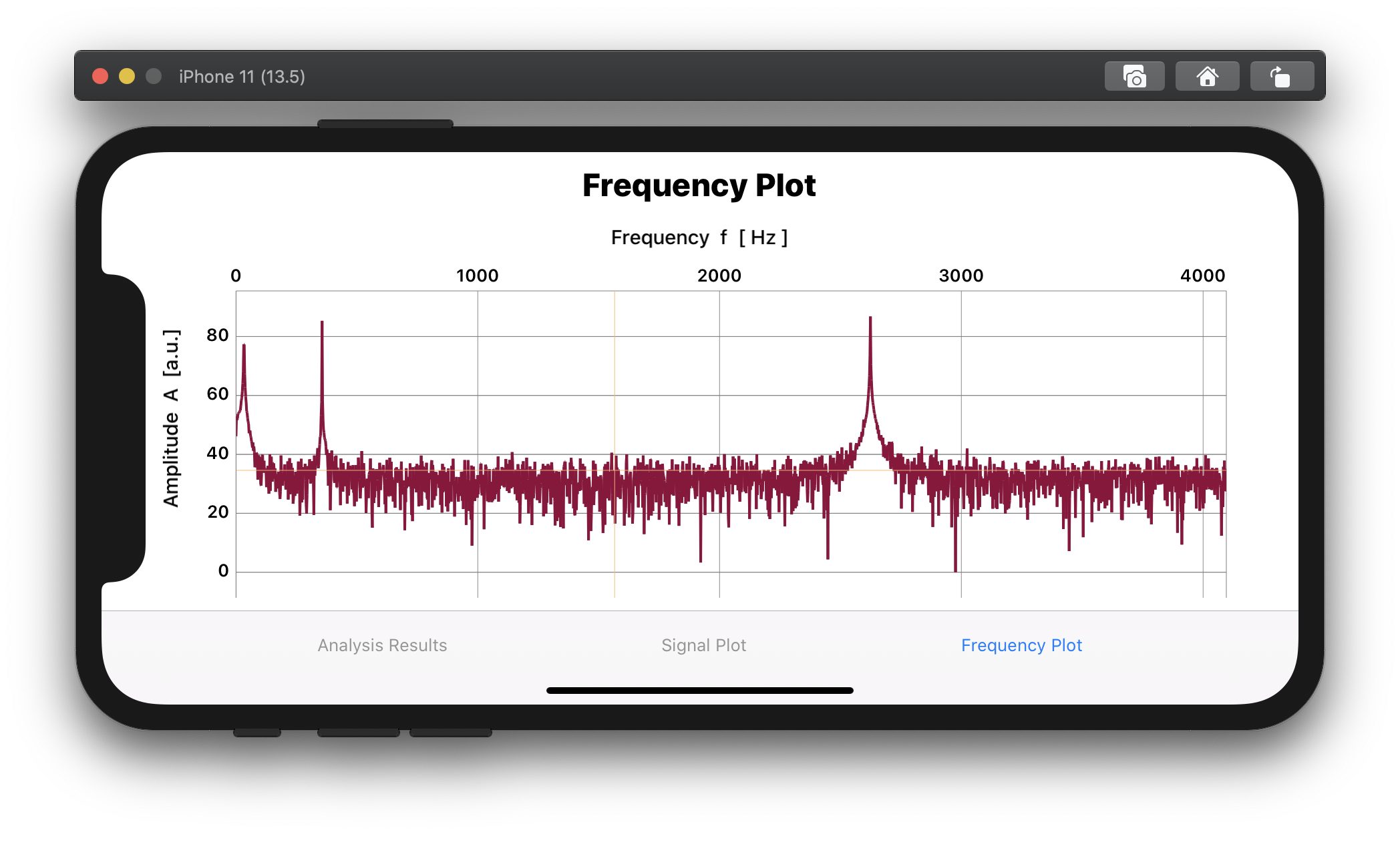
Example of a frequency plot from an FFT analysis:
The text was updated successfully, but these errors were encountered: